Web Dashboard Design: A Complete Guide for 2026
A web dashboard serves as the command center for modern businesses, transforming complex data streams into actionable intelligence through intuitive visual interfaces. Whether you're monitoring financial metrics, tracking user behavior, or managing operations, a well-designed web dashboard delivers critical information at a glance, empowering teams to make data-driven decisions quickly. As organizations increasingly rely on digital platforms to manage everything from customer relationships to supply chains, the demand for sophisticated yet user-friendly web dashboards continues to surge. This comprehensive guide explores the essential elements of web dashboard design, implementation strategies, and best practices that separate exceptional dashboards from mediocre ones.
Understanding Web Dashboard Fundamentals
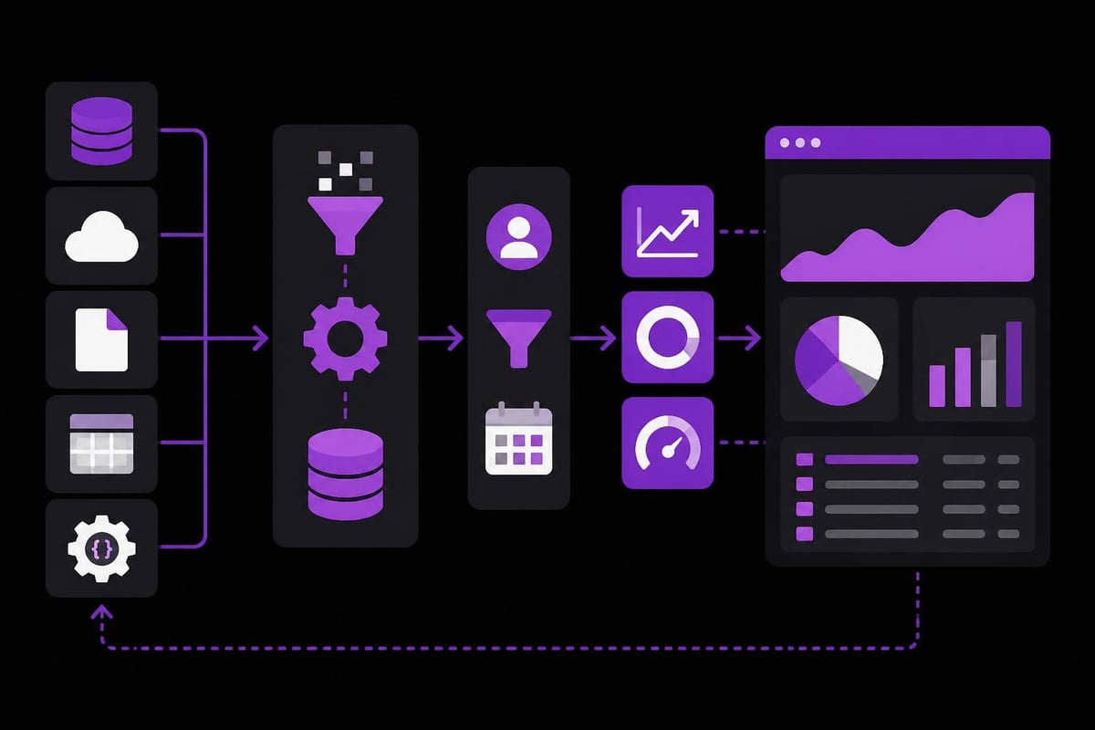
A web dashboard represents more than just a collection of charts and graphs displayed in a browser. It functions as a strategic tool that consolidates data from multiple sources, presenting it in a format that facilitates immediate comprehension and action.
The core purpose of any web dashboard centers on reducing cognitive load while maximizing information density. Users should be able to scan the interface and extract meaningful insights within seconds, without requiring extensive training or documentation. This principle drives every design decision, from color selection to widget placement.
Key Components of Effective Dashboards
Modern web dashboards typically incorporate several standard elements that work together to create a cohesive user experience:
- Data visualizations including charts, graphs, and heat maps that transform numerical data into visual patterns
- Key performance indicators (KPIs) displayed prominently to highlight critical metrics
- Filters and controls allowing users to customize views and drill down into specific data segments
- Real-time updates ensuring information remains current and actionable
- Responsive layouts adapting seamlessly across devices and screen sizes
The selection and arrangement of these components depends heavily on user needs and business objectives. A web development approach that prioritizes user research ensures the final product aligns with actual workflows rather than assumed requirements.
Types of Web Dashboards
Different business functions require distinct dashboard approaches. Strategic dashboards focus on high-level metrics and long-term trends, typically updated daily or weekly. These interfaces serve executives and stakeholders who need to monitor overall organizational health.
Operational dashboards prioritize real-time data and immediate alerts. They track processes as they unfold, enabling rapid response to emerging issues. Customer support teams, logistics coordinators, and system administrators rely heavily on this dashboard type.
Analytical dashboards dive deep into historical data, supporting complex queries and exploratory analysis. These tools incorporate advanced filtering, custom date ranges, and comparative views that help analysts uncover patterns and test hypotheses.
| Dashboard Type | Update Frequency | Primary Users | Key Features |
|---|---|---|---|
| Strategic | Daily/Weekly | Executives, Stakeholders | Trends, forecasts, high-level KPIs |
| Operational | Real-time | Managers, Coordinators | Alerts, process monitoring, immediate metrics |
| Analytical | On-demand | Data analysts, Researchers | Historical data, custom queries, comparisons |
Design Principles for High-Performance Dashboards
Creating an effective web dashboard requires adherence to fundamental design principles that enhance usability and comprehension. The best dashboards balance aesthetic appeal with functional efficiency, never sacrificing clarity for visual flair.
Visual hierarchy establishes the order in which users process information. The most critical metrics should dominate the screen through size, position, and color contrast. Secondary information occupies supporting positions, while tertiary details remain accessible but unobtrusive. Following good dashboard design practices ensures your interface communicates priorities effectively.
The Power of Simplicity
Every element on a web dashboard should serve a specific purpose. Decorative features that don't contribute to understanding should be eliminated ruthlessly. White space isn't wasted space; it provides visual breathing room that prevents overwhelming users with information density.
Consider limiting the number of metrics displayed on a single screen. Research suggests that users can effectively monitor five to nine key indicators simultaneously. Beyond this threshold, cognitive load increases dramatically, reducing the dashboard's effectiveness.
Color usage demands particular attention. Colors should convey meaning consistently throughout the interface. Red typically signals problems or declines, green indicates positive trends or success, and yellow warns of caution. Avoid using colors purely for decoration, as this dilutes their communicative power.
The principles of dashboard design emphasize consistency across all visual elements. When similar data appears in multiple locations, it should maintain identical formatting, ensuring users can instantly recognize and interpret information regardless of context.
Technical Implementation Strategies
Building a web dashboard involves strategic decisions about architecture, technology stack, and data integration. The choices made during initial development significantly impact long-term scalability, performance, and maintenance requirements.
Selecting the Right Technology Stack
Modern web dashboards typically leverage frameworks that support reactive data binding and component-based architecture. React, Vue.js, and Angular remain popular choices for frontend development, each offering robust ecosystems of charting libraries and UI components.
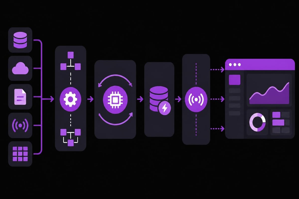
Backend systems must handle data aggregation efficiently, especially when pulling from multiple sources. Microservices architectures provide flexibility, allowing individual data services to scale independently based on load. API gateways coordinate communication between frontend interfaces and backend services.
- Database selection impacts query performance and real-time capabilities
- Caching strategies reduce server load and improve response times
- WebSocket connections enable live data updates without constant polling
- CDN integration accelerates asset delivery for global users
Performance optimization becomes critical as data volumes grow. Implementing pagination, lazy loading, and data sampling techniques prevents the web dashboard from grinding to a halt when processing large datasets. Product design expertise helps identify potential bottlenecks before they impact user experience.
Data Integration Challenges
Most web dashboards pull information from disparate sources, each with unique formats, update schedules, and access protocols. Creating a unified view requires robust ETL (Extract, Transform, Load) processes that standardize data before visualization.
Real-time integration presents additional complexity. Streaming data from IoT devices, transaction systems, or social media platforms demands different architectural approaches than batch processing. Message queues and event-driven architectures help manage asynchronous data flows reliably.
Security considerations pervade every integration point. Authentication, authorization, and data encryption protect sensitive information while ensuring only authorized users access specific metrics. Role-based access controls limit visibility based on organizational hierarchies and responsibilities.
Optimizing User Experience
A technically sound web dashboard still fails if users find it confusing or irrelevant. User experience optimization requires ongoing iteration based on actual usage patterns and feedback.
Personalization and Customization
Different users need different information. Providing customization options allows individuals to tailor the web dashboard to their specific roles and responsibilities. Draggable widgets, collapsible sections, and saved views empower users without requiring developer intervention.
However, excessive customization can lead to inconsistency and confusion when team members compare notes. Striking the right balance involves offering constrained flexibility within defined parameters. Allow users to rearrange components or hide irrelevant metrics, but maintain consistent data definitions and calculation methods.
Default configurations should serve the majority use case effectively. Most users won't invest time in extensive customization, so the out-of-box experience must deliver immediate value. Understanding effective dashboard design principles helps create defaults that work for diverse audiences.
Interactive Elements and Drill-Down Capabilities
Static displays limit exploration and understanding. Interactive web dashboards invite users to investigate anomalies, compare time periods, and discover relationships between metrics. Click-through navigation from summary statistics to detailed records supports both high-level monitoring and deep analysis.
Tooltips provide contextual information without cluttering the primary interface. Hovering over a data point should reveal precise values, time stamps, and relevant metadata. This approach maintains clean visuals while ensuring detailed information remains accessible.
Filter controls transform a single dashboard into multiple views. Date range selectors, category filters, and search functionality let users focus on specific segments without navigating away from the primary interface. The interactive dashboard design guide offers detailed insights into creating effective interaction patterns.
| Interaction Type | Purpose | Best Used For |
|---|---|---|
| Hover tooltips | Display detailed values | Precise data inspection |
| Click drill-down | Navigate to detailed views | Root cause analysis |
| Filter controls | Segment data dynamically | Comparative analysis |
| Time range selectors | Adjust temporal scope | Trend identification |
Mobile Responsiveness and Cross-Platform Considerations
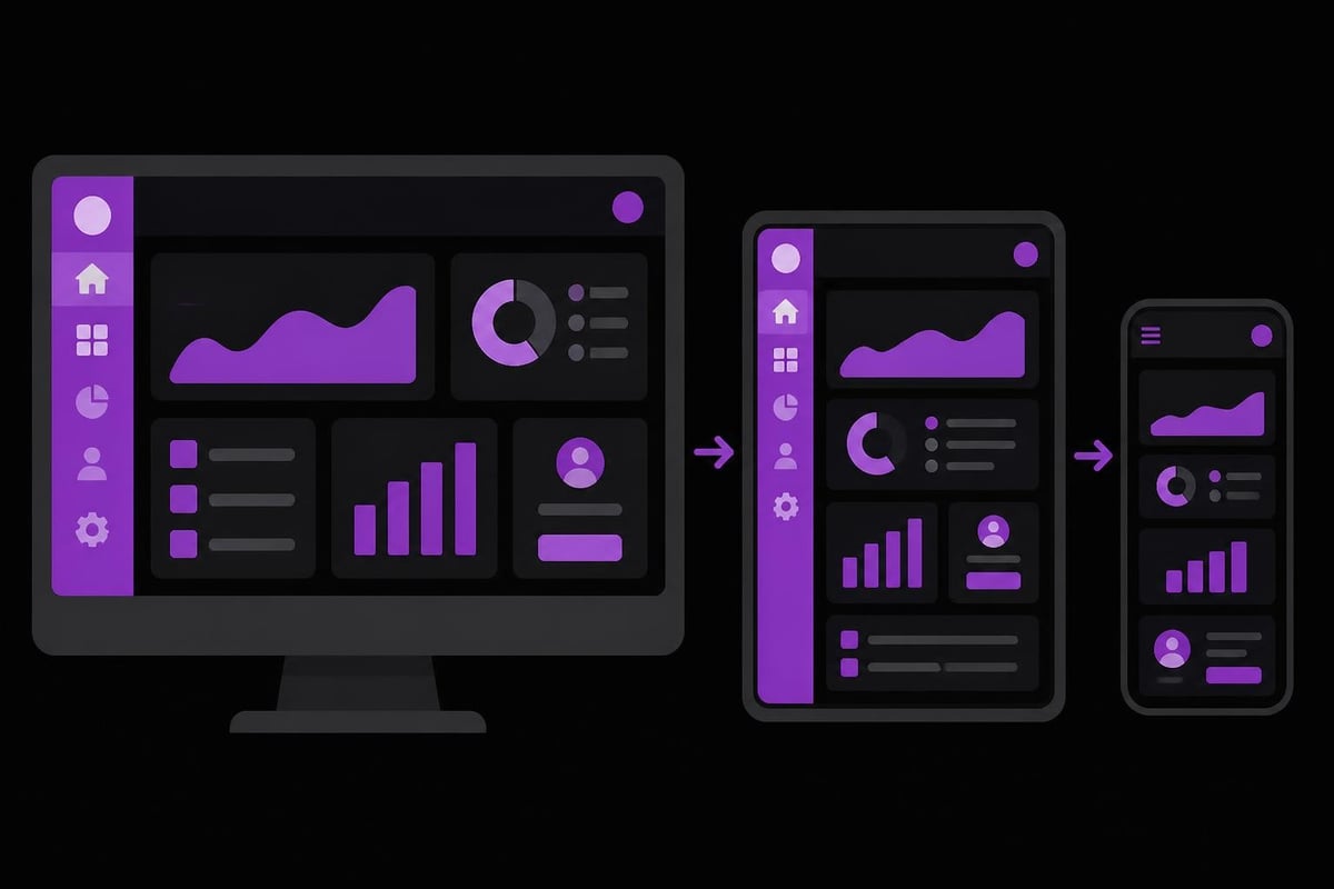
Web dashboards must function effectively across devices, from desktop monitors to smartphones. Responsive design isn't optional; it's fundamental to modern dashboard development.
Mobile interfaces face unique constraints. Screen real estate shrinks dramatically, making comprehensive overviews challenging. Prioritization becomes even more critical on small screens, often requiring different layouts and information hierarchies than desktop versions.
Touch interactions differ from mouse-based navigation. Buttons and interactive elements need larger hit targets to accommodate finger taps. Hover states don't exist on touchscreens, requiring alternative methods for revealing detailed information.
Progressive disclosure techniques help manage complexity on mobile devices. Start with the most critical metrics prominently displayed, then provide clear paths to additional details through tabs, accordions, or dedicated screens. This approach prevents overwhelming mobile users while maintaining access to comprehensive data.
Performance on Varied Connections
Mobile users often contend with slower, less reliable network connections than desktop users on corporate networks. Optimizing a web dashboard for these conditions involves aggressive asset compression, minimized API calls, and graceful degradation when connectivity drops.
Offline capabilities extend usability even when networks fail completely. Service workers can cache recent data, allowing users to review historical information and queue actions for synchronization once connectivity returns. This resilience proves particularly valuable for field workers and global teams operating in regions with inconsistent internet access.
Advanced Features and Emerging Trends
The evolution of web dashboards continues as new technologies enable capabilities previously impossible or impractical. Staying current with these developments helps maintain competitive advantages.
AI-Powered Insights
Artificial intelligence transforms web dashboards from passive displays into active advisors. Machine learning algorithms detect anomalies, predict future trends, and surface insights that humans might overlook in massive datasets. AI automation capabilities enable proactive alerts when metrics deviate from expected patterns.
Natural language queries let users ask questions in plain English rather than constructing complex filters manually. This accessibility democratizes data analysis, empowering non-technical users to extract insights independently.
Automated report generation saves countless hours previously spent compiling summaries. AI systems can identify significant changes, contextualize them with historical patterns, and generate narrative explanations of what happened and why.
Collaborative Features
Modern work happens in teams, and web dashboards increasingly support collaborative workflows. Annotation tools let users mark interesting patterns or add context directly on visualizations. Shared views ensure everyone examines the same data configuration, eliminating confusion from individualized customizations.
Integration with communication platforms brings data into existing workflows. Slack or Microsoft Teams notifications alert team members to critical changes, including relevant dashboard links for immediate investigation. This integration reduces context-switching and accelerates response times.
Export capabilities remain important despite digital-first approaches. PDF reports, CSV downloads, and scheduled email summaries serve stakeholders who prefer traditional formats or need to share insights with external partners.
Industry-Specific Dashboard Applications
Different sectors leverage web dashboards for specialized purposes, each requiring unique metrics and visualizations. Understanding these variations helps tailor implementations to specific contexts.
Financial services dashboards monitor portfolio performance, risk exposures, and regulatory compliance. Real-time market data feeds into sophisticated calculations that trigger automated alerts when thresholds breach. The complexity rivals trading dashboard design challenges, demanding millisecond responsiveness and absolute data accuracy.
E-commerce platforms track conversion funnels, inventory levels, and customer acquisition costs. Integration with payment processors, shipping carriers, and marketing platforms creates comprehensive operational views. Learning from strategies like building profitable Shopify stores reveals the metrics that actually drive business growth.
Healthcare dashboards balance patient outcomes, operational efficiency, and regulatory compliance. Privacy regulations add layers of complexity, requiring careful access controls and audit trails. Real-time monitoring of critical systems ensures patient safety while administrative views optimize resource allocation.
Gaming and Entertainment Dashboards
Gaming companies employ web dashboards to monitor player engagement, monetization metrics, and technical performance. Daily active users, session duration, and in-game purchase patterns reveal player behavior and guide content development decisions.
Server performance metrics prevent outages during peak usage periods. Monitoring concurrent connections, response times, and error rates enables proactive scaling before players experience degradation. The technical demands mirror those found when building crypto gaming platforms, where performance directly impacts user retention.
A/B testing dashboards compare variant performance, identifying which features, pricing models, or content offerings resonate with players. Statistical significance indicators prevent premature conclusions from insufficient sample sizes.
Maintaining and Evolving Your Dashboard
Launching a web dashboard marks the beginning rather than the end of the development journey. Continuous improvement based on user feedback and changing business needs ensures long-term value.
Regular usage analysis reveals which features users actually employ versus those that sounded good during planning but see no adoption. Analytics on dashboard interactions guide prioritization of enhancements and identify candidates for removal.
Version Control and Change Management
Dashboard schemas evolve as business metrics change. Maintaining backward compatibility while introducing new capabilities requires thoughtful versioning strategies. Clear migration paths help users transition smoothly when significant redesigns become necessary.
Documentation becomes critical as complexity grows. Metric definitions, calculation methodologies, and data source descriptions prevent confusion and ensure consistent interpretation across teams. When building internal tools, comprehensive documentation differentiates professional implementations from haphazard efforts.
Scheduled maintenance windows communicate when the web dashboard might be temporarily unavailable for updates. Minimizing disruptions through rolling deployments and blue-green infrastructure helps maintain availability even during active development.
Gathering and Incorporating Feedback
Direct user feedback provides invaluable insights into pain points and opportunities. Regular surveys, user interviews, and support ticket analysis reveal where the dashboard succeeds and where it falls short. The best practices for creating dashboards emphasize this user-centric iteration process.
Usage metrics complement qualitative feedback with quantitative evidence. Tracking which sections users visit, how long they spend on different views, and where they encounter errors guides improvement priorities based on actual behavior rather than opinions.
Beta testing new features with select user groups reduces risk when introducing significant changes. This approach identifies issues before they impact the entire user base while building champions who help evangelize improvements.
Security and Compliance Considerations
Web dashboards often display sensitive business data, making security a paramount concern throughout design and implementation. Comprehensive security strategies address threats at multiple layers.
Authentication mechanisms verify user identities before granting access. Multi-factor authentication adds protection against credential compromise. Single sign-on integrations with existing identity providers simplify user management while maintaining security standards.
Authorization controls determine what authenticated users can actually see and do. Role-based access limits visibility to relevant metrics, preventing unauthorized access to sensitive information. Row-level security ensures users only view data they're permitted to access, even when sharing underlying data sources.
Data encryption protects information in transit and at rest. HTTPS connections prevent interception during transmission, while database encryption shields stored data from unauthorized access. These measures prove essential when handling financial records, personal information, or proprietary business intelligence.
Audit logging tracks who accessed what information and when. These records support compliance requirements, security investigations, and usage analysis. Retention policies balance operational needs against storage costs and privacy regulations.
Scaling Dashboards for Enterprise Use
As organizations grow, web dashboards must scale to support increasing users, data volumes, and complexity. Planning for scale from the beginning prevents costly rewrites later.
Horizontal scaling distributes load across multiple servers, preventing any single point of failure. Load balancers route requests intelligently, directing traffic to available resources and improving overall reliability.
Caching strategies dramatically reduce database load and improve response times. In-memory caches store frequently accessed queries, returning results instantly without database round trips. Cache invalidation strategies ensure users see current data while maximizing cache hit rates.
Database optimization becomes critical at scale. Proper indexing accelerates queries, partitioning manages large tables efficiently, and materialized views pre-calculate complex aggregations. Regular performance monitoring identifies degradation before it impacts user experience.
The architecture approaches used in building SaaS MVPs provide foundations for scalable dashboard systems, emphasizing modular design and performance from inception.
Effective web dashboards transform how organizations understand and act on data, turning abstract numbers into concrete insights that drive better decisions. By focusing on user needs, adhering to design principles, and implementing robust technical foundations, businesses create dashboard experiences that truly empower their teams. Whether you're building a financial monitoring system, operational command center, or customer analytics platform, Absolute Foundry delivers the engineering expertise and product design capabilities to bring your vision to life, creating dashboards that scale with your business and adapt to evolving requirements.