Design of Web: Best Practices for Product Engineers
The design of web applications has evolved dramatically over the past decade, moving from simple static pages to complex, interactive platforms that power businesses worldwide. For product engineering teams building everything from payment rails to AI-powered dashboards, understanding foundational design principles isn't optional-it's essential for creating products that users actually want to use. The challenge lies not just in making things look good, but in crafting experiences that balance aesthetics with functionality, performance with features, and innovation with usability. This comprehensive guide explores the critical aspects of web design that product engineers need to master in 2026.
Understanding the Foundation of Modern Web Design
The design of web platforms today requires a fundamental shift in thinking compared to traditional approaches. Instead of treating design as a final polish applied before launch, successful product teams integrate design thinking from day one.
Mobile-First as the Default Strategy
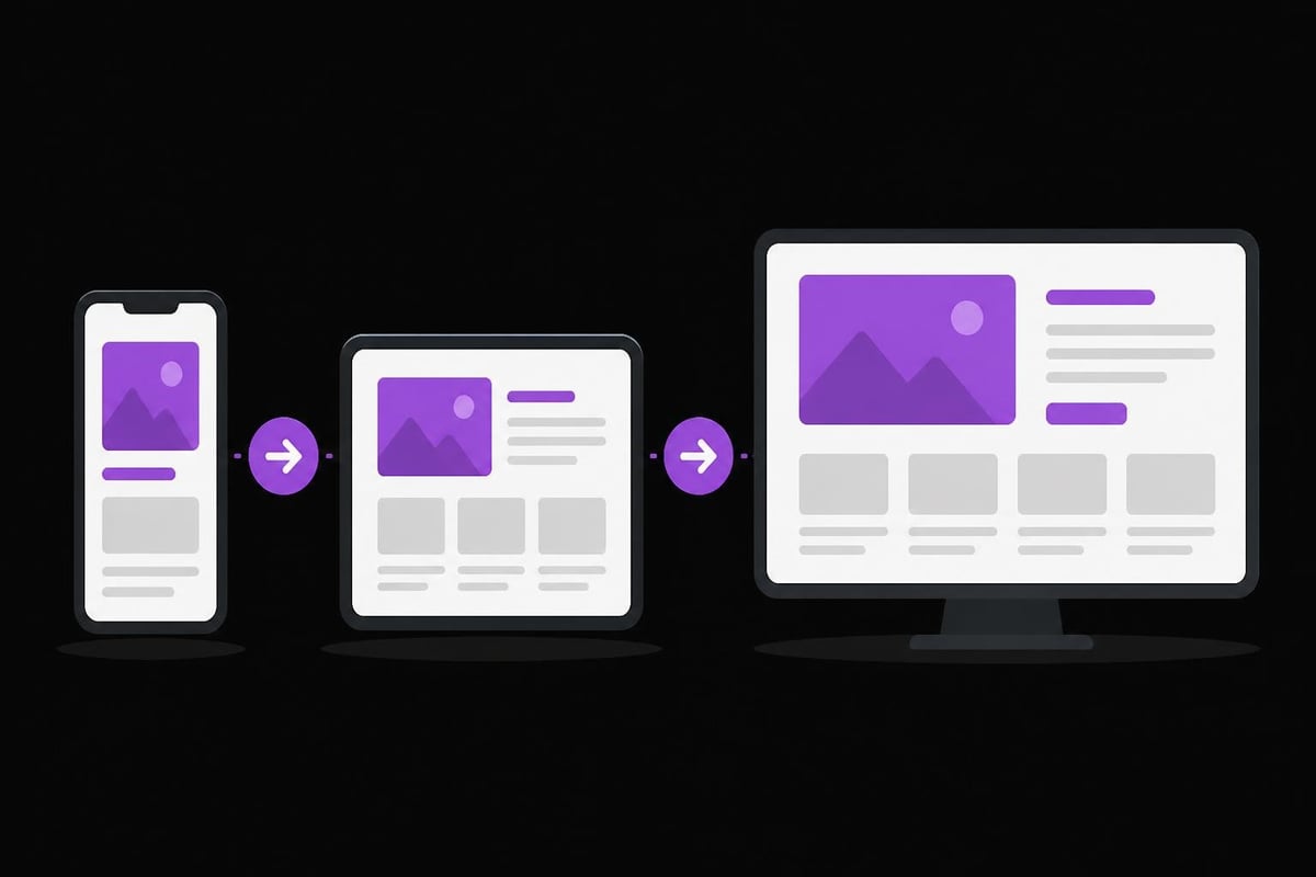
Mobile traffic now accounts for over 60% of all web visits, making mobile-first design not just a best practice but a business necessity. This approach means starting with the smallest screen size and progressively enhancing the experience for larger devices.
Key mobile-first principles include:
- Touch-friendly interface elements (minimum 44x44 pixel tap targets)
- Simplified navigation optimized for thumb reach zones
- Content prioritization showing essential information first
- Performance optimization for varying network conditions
When building production dApps or payment systems, mobile responsiveness directly impacts conversion rates and user retention. According to Weber Media's article on modern web design best practices, sites that fail mobile usability tests see bounce rates increase by up to 123%.
Performance Architecture
The design of web experiences must account for performance from the initial concept phase. Every design decision-from image placement to animation complexity-carries performance implications that affect user experience and search engine rankings.
| Performance Metric | Target Value | Business Impact |
|---|---|---|
| First Contentful Paint | Under 1.8s | 32% conversion improvement |
| Time to Interactive | Under 3.9s | 53% bounce rate reduction |
| Cumulative Layout Shift | Under 0.1 | Better user engagement |
| Largest Contentful Paint | Under 2.5s | Higher search rankings |
Product teams should implement performance budgets during the design phase, not after development. This means designing with constraints: limiting the number of web fonts, optimizing image specifications before creation, and planning for lazy loading strategies in the initial wireframes.
Creating User-Centric Design Systems
A robust design system serves as the foundation for consistent, scalable web products. For engineering foundries managing multiple client projects simultaneously, design systems eliminate redundant work while ensuring quality across all deliverables.
Component-Based Architecture
Breaking interfaces into reusable components accelerates development while maintaining consistency. This modular approach aligns perfectly with modern development frameworks and enables teams to iterate quickly.
Essential component categories:
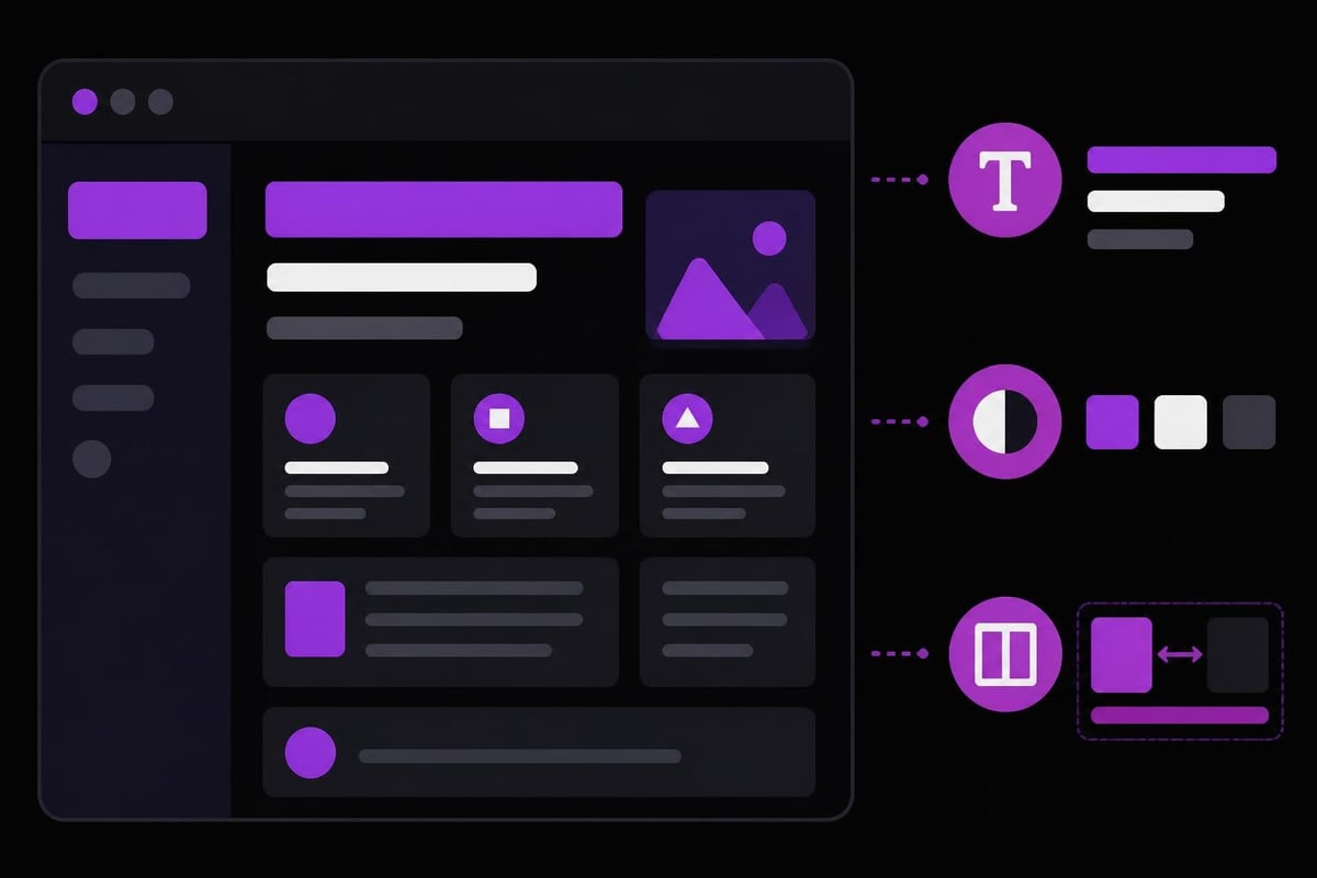
- Foundation elements - Typography, color palettes, spacing systems, iconography
- Core components - Buttons, forms, cards, modals, navigation patterns
- Composite patterns - Dashboard layouts, data tables, onboarding flows
- Domain-specific modules - Payment forms, trading interfaces, admin panels
When designing trading dashboards or complex financial interfaces, component libraries ensure that critical interface elements maintain consistency even as products scale.
Accessibility by Default
The design of web products must prioritize accessibility not as an afterthought but as a core requirement. This means implementing WCAG 2.1 Level AA standards from the beginning, which benefits all users regardless of ability.
Proper semantic HTML structure, sufficient color contrast ratios (minimum 4.5:1 for normal text), keyboard navigation support, and screen reader compatibility should be non-negotiable elements in every design specification. The Interface Guidelines resource provides framework-agnostic principles for creating accessible interactions that work across all assistive technologies.
Visual Hierarchy and Information Architecture
Effective visual hierarchy guides users through complex information without overwhelming them. This becomes critical when building data-intensive applications like analytics dashboards or financial platforms.
Strategic Use of White Space
White space (or negative space) isn't wasted space-it's a powerful design tool that improves comprehension and reduces cognitive load. Research shows that proper spacing can increase reading comprehension by up to 20%.
The design of web interfaces should incorporate white space at multiple levels:
- Micro white space between elements (padding, margins)
- Macro white space around major sections and components
- Active white space deliberately placed to guide attention
- Passive white space naturally occurring between elements
Typography as a Functional Element
Typography serves dual purposes in web design: conveying information and creating emotional resonance. Product engineers should understand how type choices impact both readability and brand perception.
| Typography Decision | Impact on UX | Technical Consideration |
|---|---|---|
| Font selection | Reading speed, brand identity | Load time, licensing |
| Scale system | Content hierarchy, scannability | Responsive scaling |
| Line height | Reading comfort, density | Mobile readability |
| Line length | Reading efficiency | Responsive breakpoints |
The optimal line length for reading comprehension sits between 50-75 characters per line. For technical content or data-heavy interfaces, slightly shorter lines (45-60 characters) improve accuracy when users scan for specific information.
Responsive Design Beyond Breakpoints
While responsive design traditionally focuses on adapting layouts to different screen sizes, modern approaches consider context, capability, and user intent alongside device dimensions.
Fluid Grids and Flexible Images
The design of web layouts should use relative units (percentages, viewport units, rem) rather than fixed pixels. This creates truly flexible designs that adapt smoothly across the full spectrum of devices rather than jumping awkwardly at predefined breakpoints.
Implementing fluid design:
- Establish a flexible grid system based on percentages or CSS Grid
- Use max-width constraints to prevent excessive stretching on large screens
- Implement responsive images with srcset and sizes attributes
- Design flexible containers that adapt to content rather than forcing content into rigid structures
For projects like building marketplaces where product listings need to work across devices, fluid grids ensure optimal presentation regardless of screen size. The principles outlined by UXPin on responsive design best practices emphasize the importance of planning responsive behavior during wireframing rather than treating it as a development-phase concern.
Container Queries and Component Responsiveness
Traditional media queries respond to viewport size, but container queries allow components to respond to their parent container's dimensions. This enables truly modular, context-aware components that adapt based on available space rather than overall screen size.
This approach proves invaluable when designing complex dashboards where the same component might appear in a sidebar, main content area, or modal window-each requiring different responsive behavior based on its container, not the viewport.
Interaction Design and Microinteractions
The design of web interactions shapes how users perceive product quality and reliability. Well-crafted microinteractions provide feedback, prevent errors, and create delightful moments that differentiate products in competitive markets.
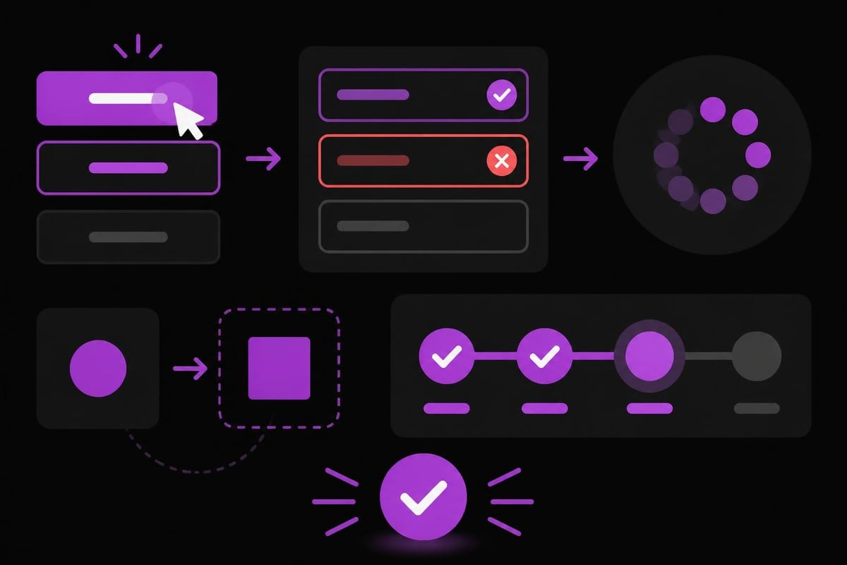
Feedback Loops and State Changes
Every user action should generate immediate, clear feedback. This principle becomes especially critical in financial applications or smart contract interfaces where users need confidence that their actions registered correctly.
- Loading states - Show progress for operations taking over 200ms
- Success confirmations - Clearly communicate completed actions
- Error prevention - Guide users before problems occur
- Error recovery - Provide clear paths to resolution when issues arise
Animation with Purpose
Animations should serve functional purposes: directing attention, explaining transitions, providing feedback, or maintaining context during changes. Gratuitous animation increases cognitive load and slows task completion.
The optimal animation duration for most web interactions ranges from 200-500ms. Shorter feels abrupt; longer feels sluggish. Complex transitions might extend to 800ms, but anything beyond that risks feeling unresponsive.
Color Theory and Brand Application
Color choices in the design of web products impact usability, accessibility, and brand perception simultaneously. Strategic color application requires balancing aesthetic goals with functional requirements.
Functional Color Systems
Beyond brand colors, effective web design requires a comprehensive color system supporting multiple use cases:
- Primary palette - Brand colors for key actions and identity
- Neutral palette - Grays for backgrounds, borders, and secondary content
- Semantic palette - Colors conveying meaning (success, warning, error, info)
- Extended palette - Lighter and darker variants for hover states, disabled elements
When creating high-converting fintech landing pages, color psychology influences trust signals and conversion actions. Financial applications typically lean toward blues and greens (trust, stability) while gaming platforms might embrace more vibrant, energetic palettes.
Content-First Design Methodology
The design of web experiences should start with content strategy, not visual mockups. Understanding what content needs to be communicated, to whom, and why informs every subsequent design decision.
Designing for Scannability
Users don't read web pages-they scan them. Eye-tracking studies consistently show F-patterns and Z-patterns dominating how users consume web content. Design should accommodate this behavior rather than fight it.
Scannable content techniques:
- Descriptive headings that communicate value independently
- Bullet lists for features, specifications, or sequential information
- Bold text highlighting key terms and takeaways
- Short paragraphs (3-4 sentences maximum) with clear topic sentences
- Strategic use of pull quotes or callouts for critical information
Clay's article on website design tips emphasizes that supporting scanning behavior doesn't mean dumbing down content-it means respecting users' time and attention by making information accessible.
Forms and Conversion Optimization
Forms represent critical conversion points in most web products, yet they're often poorly designed. The design of web forms directly impacts completion rates, data quality, and user satisfaction.
Reducing Friction in Data Entry
Every form field represents friction. Product teams should ruthlessly eliminate unnecessary fields and optimize required ones for ease of completion.
| Form Optimization | Impact | Implementation |
|---|---|---|
| Autofill support | 35% faster completion | Proper input name/autocomplete attributes |
| Inline validation | 28% fewer errors | Real-time feedback on field completion |
| Smart defaults | 22% higher completion | Pre-populate known information |
| Single column layout | 15% better completion | Vertical form progression |
When building SaaS MVPs or onboarding flows, form design often determines whether users complete registration or abandon the process. Error messages should be specific, constructive, and positioned near the relevant field rather than grouped at the top.
Design for Performance and Scalability
The design of web applications must account for technical constraints and scaling challenges from the outset. Beautiful designs that don't perform well fail users and businesses alike.
Image Optimization Strategy
Images typically account for 50-60% of page weight, making image optimization critical for performance. Design decisions around imagery should consider format, dimensions, and delivery method.
Modern image best practices:
- Use WebP or AVIF formats with JPG/PNG fallbacks
- Implement responsive images with appropriate sizes for different viewports
- Lazy load images below the fold
- Design with aspect ratio boxes to prevent layout shift
- Consider CSS and SVG alternatives for simple graphics
Progressive Enhancement Approach
Rather than building the most feature-rich version and trying to make it work on all devices, progressive enhancement starts with a core experience that works everywhere, then adds enhanced features for capable devices and browsers.
This philosophy proves especially valuable when building mobile apps or web products targeting global audiences with varying device capabilities and network conditions. The principles outlined for professional web development emphasize quality foundations over quick feature additions.
Testing and Iteration in Design
The design of web products improves through systematic testing and data-informed iteration. Assumptions about user behavior, no matter how well-informed, require validation through real-world usage.
Multi-Device Testing Protocols
Designs must be tested across the actual device ecosystem users employ, not just browser developer tools. Real devices reveal touch interaction issues, performance problems, and rendering inconsistencies that emulators miss.
Essential testing coverage:
- Latest iOS Safari on iPhone (both standard and Plus/Max sizes)
- Chrome and Samsung Internet on Android (midrange and budget devices)
- Desktop browsers (Chrome, Firefox, Safari, Edge) at common resolutions
- Tablet devices in both portrait and landscape orientations
- Assistive technologies (screen readers, keyboard-only navigation)
A/B Testing Design Decisions
For products with sufficient traffic, A/B testing validates design hypotheses with actual user behavior data. This proves particularly valuable for high-stakes decisions around navigation structure, call-to-action placement, or form design.
However, not every design element requires A/B testing. Established usability principles (like sufficient color contrast or touch target sizes) don't need validation-they should be implemented by default based on existing research.
Emerging Considerations in Web Design
As technology evolves, the design of web experiences must adapt to new interaction paradigms and user expectations while maintaining core usability principles.
Voice and Conversational Interfaces
Voice interactions are becoming common in web applications, particularly for accessibility and hands-free scenarios. Designing for voice means considering conversation flow, error handling, and fallback options when voice recognition fails.
AI-Assisted Design Workflows
AI tools are transforming design workflows, from generating initial concepts to automating repetitive tasks. However, as noted in Alf Design Group's guide to web design best practices, AI should augment human designers rather than replace them-especially for strategic decisions around user needs and business goals.
Product teams should evaluate AI tools for specific use cases: generating layout variations, creating placeholder content, optimizing images, or identifying accessibility issues. The value lies in freeing designers to focus on strategic challenges rather than mechanical tasks.
Dark Mode and Theme Support
User preference for dark mode continues growing, making theme support an expected feature rather than a nice-to-have enhancement. The design of web interfaces should account for both light and dark color schemes from the initial design phase.
This means defining color systems based on semantic meaning rather than specific hex values, ensuring sufficient contrast in both modes, and testing all interface elements in each theme variation.
Design Operations and Team Collaboration
As design's role in product success becomes clearer, establishing effective design operations (DesignOps) processes ensures quality and consistency across projects.
Documentation and Handoff
Clear design documentation bridges the gap between design intent and development implementation. This includes annotated specifications, interaction details, responsive behavior notes, and accessibility requirements.
Modern design tools offer built-in handoff features, but they don't replace clear communication. Design files should be self-documenting with named layers, organized component libraries, and explanatory notes for complex interactions.
Cross-Functional Collaboration
The design of web products benefits from early collaboration between designers, developers, and product managers. This prevents scenarios where designs prove technically infeasible or miss critical business requirements.
At Absolute Foundry, cross-functional teams collaborate throughout the product lifecycle, ensuring design decisions align with technical capabilities and business objectives from day one. This integrated approach reduces rework and accelerates time-to-market.
Mastering the design of web applications requires balancing user needs, business objectives, and technical constraints while staying current with evolving best practices and technologies. Whether you're building payment rails, trading platforms, or AI-powered tools, design quality directly impacts product success. Absolute Foundry specializes in translating these principles into production-ready products, offering end-to-end web design services that combine strategic thinking with technical execution. Ready to transform your product vision into reality? Absolute Foundry provides the expertise and capacity to bring your web product to market.